Tina Docs
This is an advanced-use feature, and likely not something you'll need to configure. What you probably want is the content types reference!
The List Field represents an array of primitive values — specifically strings or numbers.
Use this field when you want to support multiple entities that all output a single value. Each entity will appear in a list where you can edit, add and delete them. Fields that can be used to edit the array of primitive values in the list are: text, textarea, number & select.

Options
interface ListFieldDefinititon extends Field {component: 'list'name: stringfield: {component: 'text' | 'textarea' | 'number' | 'select'}label?: stringdescription?: stringdefaultItem?: string | number | (() => string | number)itemProps?: (item: object) => {key?: string}}
| Option | Description |
component | The name of the plugin component. Always 'list'. |
name | The path to some value in the data being edited. |
field | The field that will render to edit each list item. Component Options: 'text', 'textarea', 'number', or 'select' |
label | A human readable label for the field. Defaults to the name. (Optional) |
description | Description that expands on the purpose of the field or prompts a specific action. (Optional) |
defaultItem | Provides the list items with default data upon being created. Returns an empty string if no value is provided. (Optional) |
itemProps | A function that generates props for each list item. It takes the item as an argument. (Optional) ...It returns an object containing, key: This property is used to optimize the rendering of lists. If rendering is causing problems, use defaultItem to generate a new key, as is seen in this example. Feel free to reference the React documentation for more on keys and lists. |
This interface only shows the keys unique to the list field. Visit the Field Config docs for a complete list of options.
Definition
Below are some examples of how a list field could be defined in a form.
With the text field
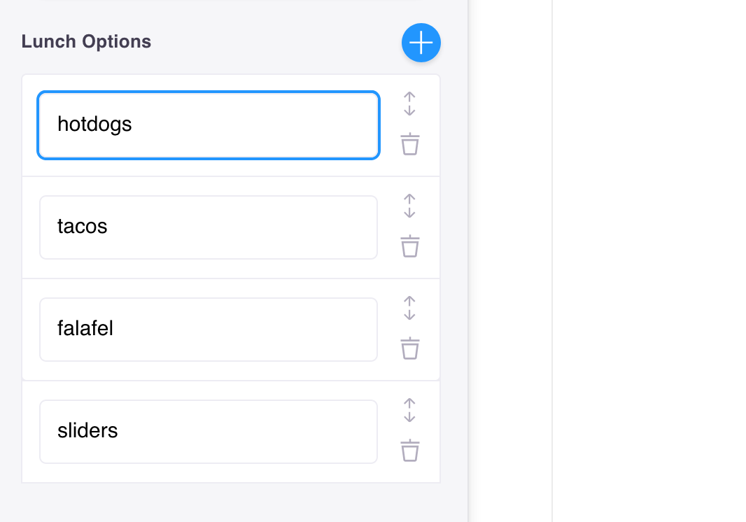
For example, if we had a list of lunch options in the frontmatter of a Markdown file:
example data
---lunch_menu:- Hotdog- Tacos- Falafel- Sliders---
Our list field config could look like this:
const formOptions = {fields: [{label: 'Lunch Options',name: 'frontmatter.lunch_menu',component: 'list',defaultItem: 'Turkey & Swiss',field: {component: 'text',},},],}
Note: The above configuration would look the same for the textarea field.
With the number field
Below is an example using the number field if we had an array of 'Pinball Scores' to manage.
example data
{ "pinball_scores": [554700, 522400, 281890, 161140] }
The list field config could look like this:
const formOptions = {fields: [{label: 'Pinball High Scores',name: 'pinball_scores',component: 'list',defaultItem: 0,field: {component: 'number',},},],}
With the select field
Below is an example using the select field if we wanted to rank the best Beatles Albums.
example data
{"beatles_albums": ["The Beatles(White Album)","Let It Be","Abbey Road","Sgt. Pepper's Lonely Hearts Club Band"]}
The list field config could look like this:
const formOptions = {fields: [{label: 'Top 5 Beatles Albums',name: 'beatles_albums',component: 'list',defaultItem: 'Abbey Road',field: {component: 'select',options: ['Let It Be','Abbey Road','Yellow Submarine','The Beatles(White Album)','Magical Mystery Tour',"Sgt. Pepper's Lonely Hearts Club Band",'Revolver','Yesterday...and Today','Rubber Soul','Help!',"A Hard Day's Night",],},},],}
© TinaCMS 2019–2024